W07 Developer tools · Developer tools
React Component Kit
32 headless, accessible React components with copyable source and a public registry.
S01 Snapshots
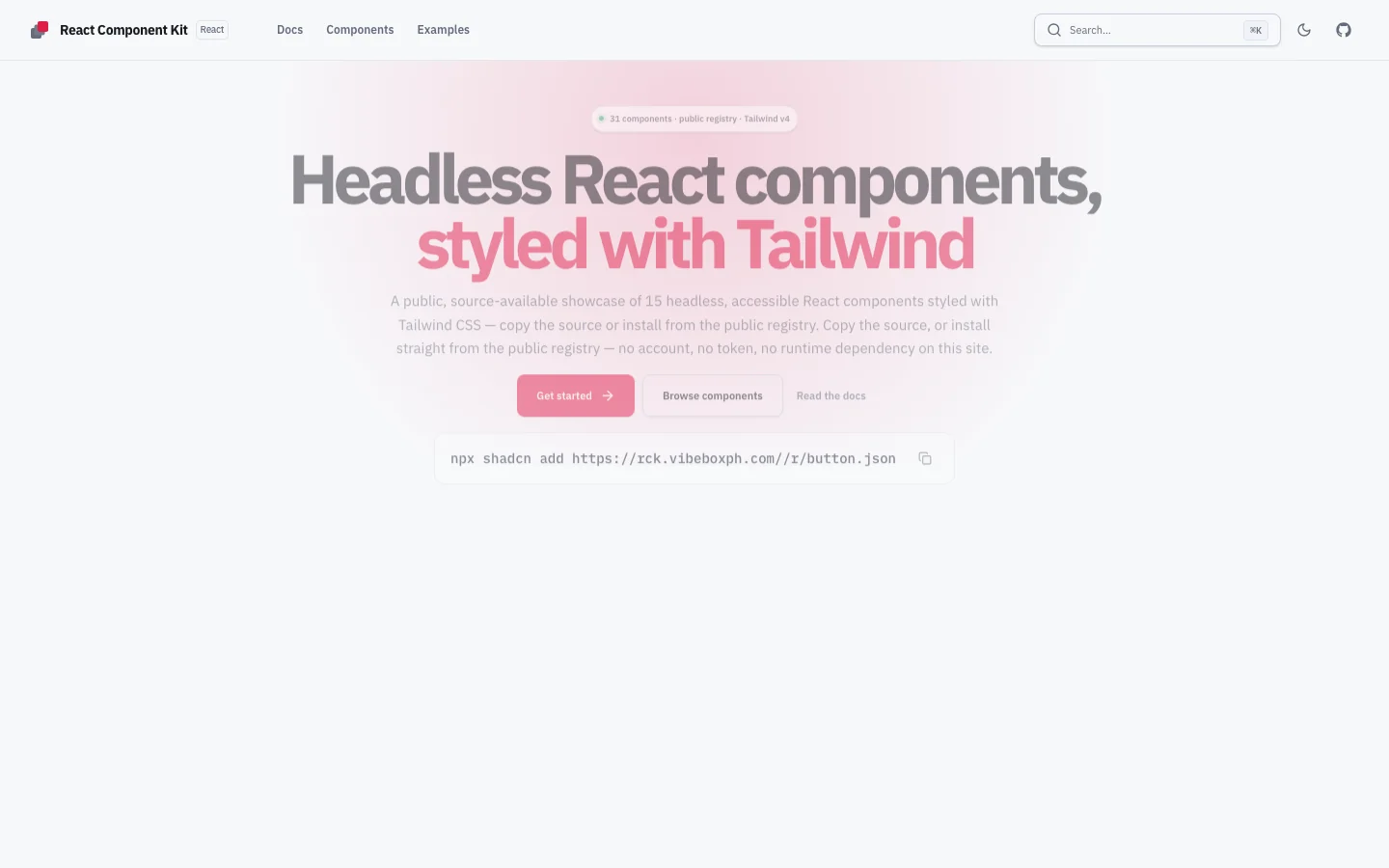
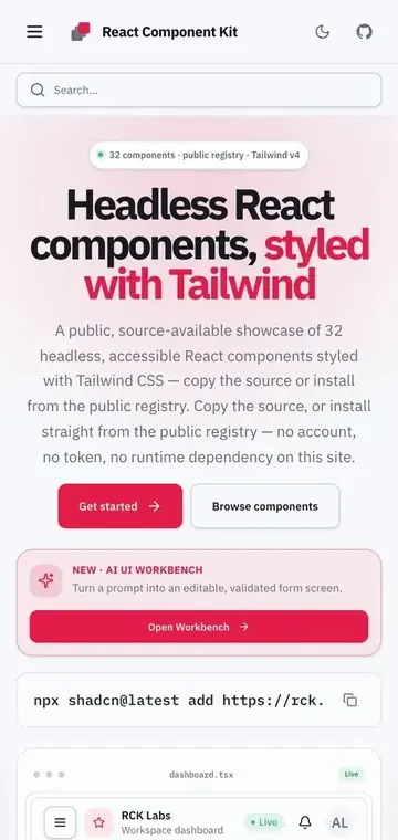
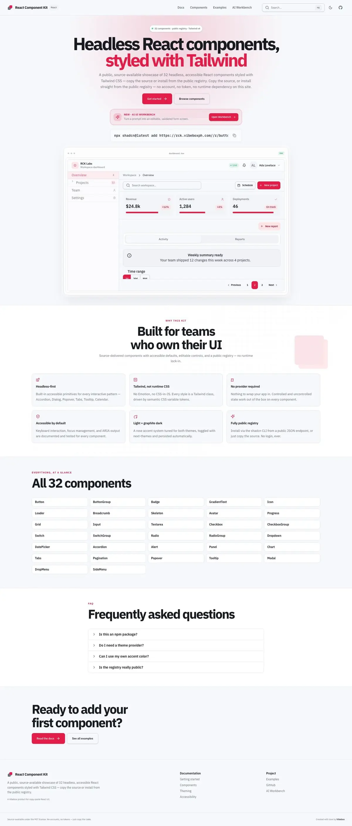
React Component Kit, as it ships.
Real captures of the build: the desktop view, the phone, and the whole page.
C01 What it is
The build, in passes.
A source-available showcase of 32 headless, accessible React components styled with Tailwind CSS and no external UI dependencies. Docs, the examples gallery and the public registry all read one metadata source, so the docs cannot drift from the code. An AI UI Workbench lives inside the same site.
- 32 components, from Button to Command, built on native element props plus className
- Controlled and uncontrolled state, composable parts, no required provider, no CSS-in-JS
- One metadata source drives component pages, prop tables, examples and the registry JSON
- Light and graphite-dark themes from semantic CSS variable tokens
- AI UI Workbench at /workbench
C02 How it is built
Wired from the real dependencies.
Every node is a package the repository actually depends on. Hover one to light its neighbours.
- Next.js
- React
- TypeScript
- Tailwind CSS
- Motion
- Zod
- Vitest
- Playwright
C03 Evidence
What the repository says.
Committed under my name and my VibeBox studio accounts. The frame above is drawn in code from this page’s own data; it is an illustration, not a screenshot.